Map Application
Case Study // Mobile Design
Abstract
Problem: On campus I would often overhear students chuckling as they realize, they were in the same big building as their friends earlier in the day - without noticing. This made me think about how often we move right past each other in a busy world.
Solution: The Map App! An updated form of mapping application, designed to put social needs first.
It blends the functionality of traditional mapping systems with highly social friend-mapping aspects, allowing users to toggle themselves in and out of the world at will.
Many social media platforms ignore the physical connection of people from their apps (Could it be because the second you see friends, phones go into pockets?). But of course, humans are physical creatures, so hopefully my theory has merit.
Background
Role: UX / UI Design
Medium: Mobile App (iOS / Android)
Tools: Pen & Paper, Competitive Analysis, Sketch
Deliverables: Sketches, Wireframes, High-Fidelity Mockups
Competitive Analysis
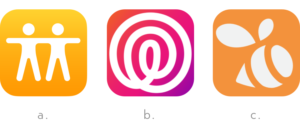
Direct competitors in the location-based social application space:
a. Find My Friends is a default native app on IOS and it leverages the users Apple ID to locate and share their location with the people of their choosing. Our most direct competitor, due to situational similarity.
b. Life360 is an application that focuses on family interaction and safety. It allows parents to keep track of their children and spouses. It promotes a “circles” feature that prompts users to group their contacts for blanket messaging.
c. Swarm is largely a competition-based application. It’s focus is gamification, allowing users to check into places, and compete to actively earn points. Being able to see locations of friends and family is a secondary component of the app.

My version was designed to compete with Find My Friends, and promotes messaging to plan meet-ups and social interaction. It also allows you to route yourself to friends locations with one tap, making physical connection the primary function.
Architecture
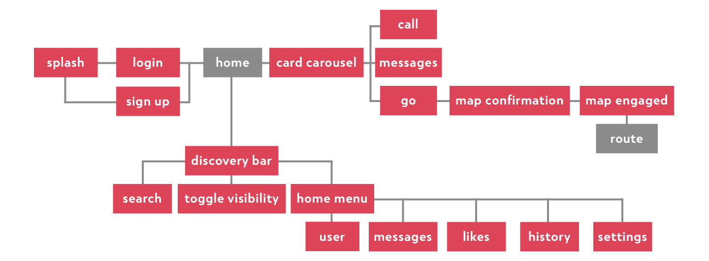
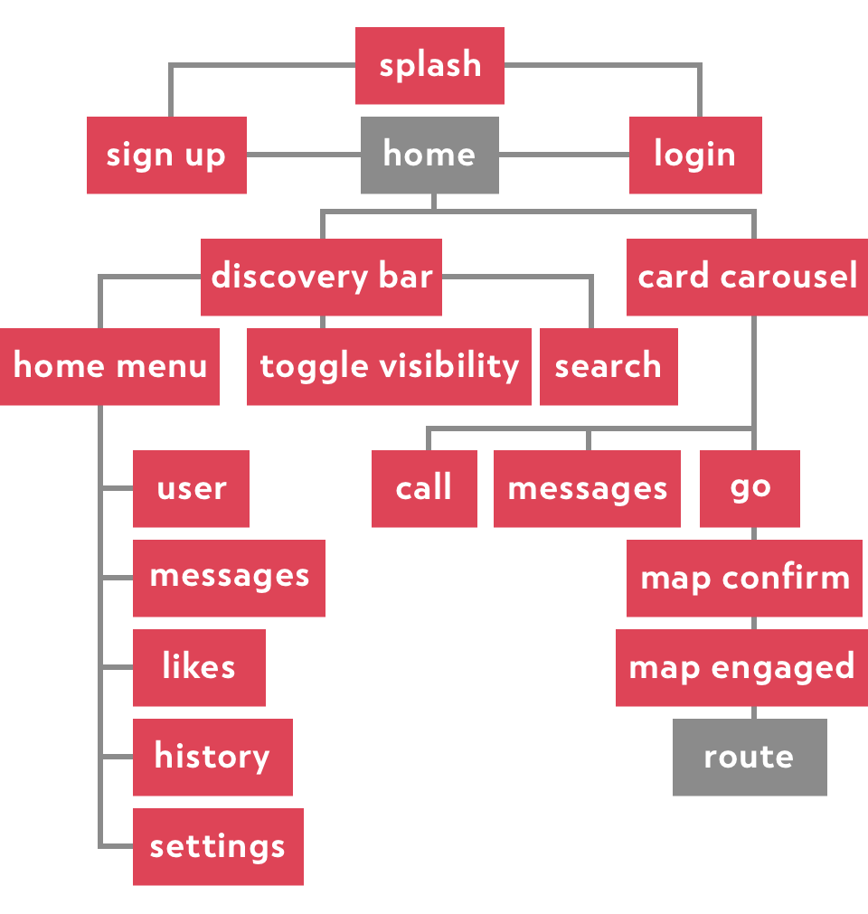
While fleshing out this design, I created a map representing how users may navigate the application. To keep the app human-centered, I ensured the most social feature - meeting friends - is always one tap away.
Grey frames indicate intended start / end points.

User Flows
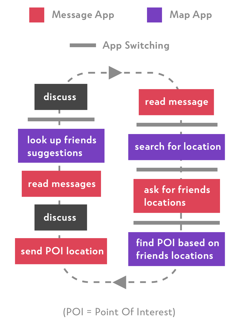
Pictured below, a diagram of how a group might switch between applications when choosing a location to meet.

Even for groups that live close, meeting up involves a level of effort. Pain points in this process include coordination of members attending, relative distances of each member, carpooling, choosing a venue and transitioning between apps.
To discuss and confirm a POI, users must switch between applications roughly five times.
Iconography
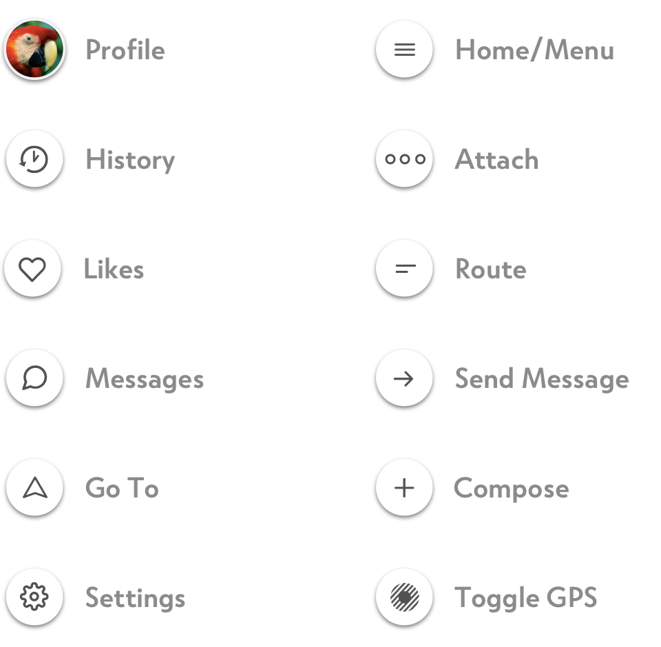
A system of icons was developed for this application, which needed to feel consistent, including corners, angles and stroke weights.

Designs
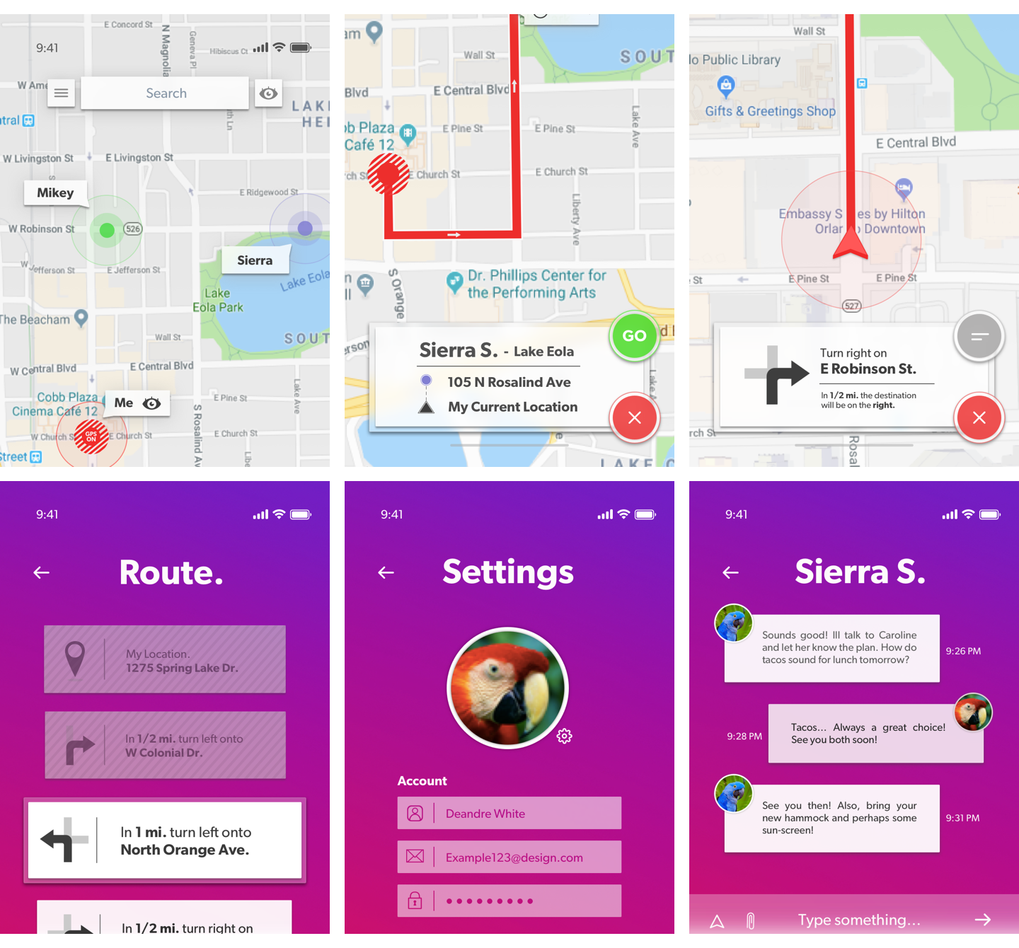
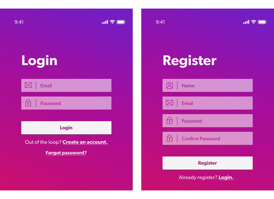
I felt that to be truly social, the app should incorporate a playful and friendly feeling throughout. To achieve this, I decided to keep the color scheme vibrant and the design choices minimalistic where possible.

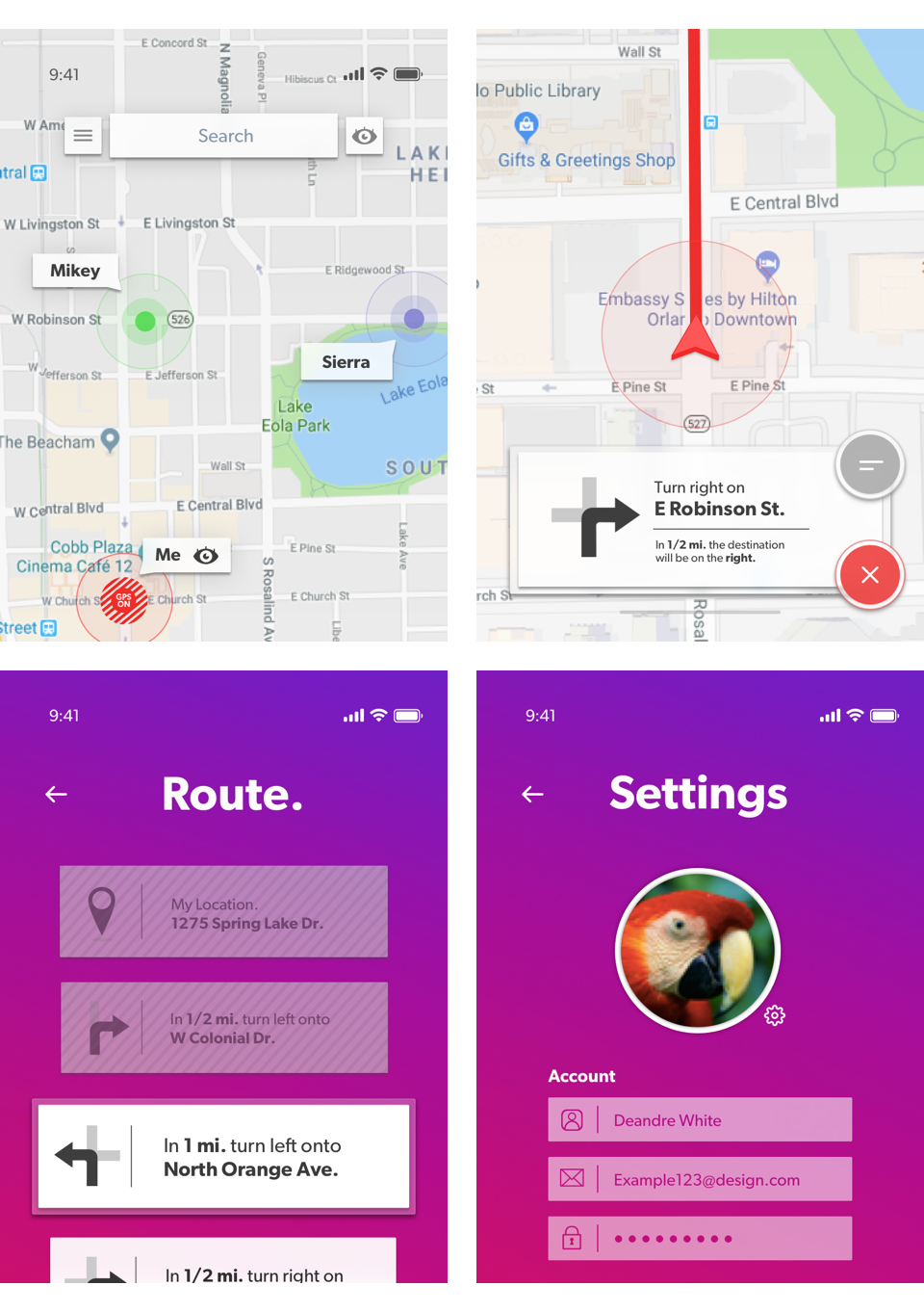
During the final stages of design, I decided to specifically focus on the functionality of the Discovery Bar (shown in the first image below). Essentially a search bar that plays an important role in app navigation. When a name is searched, the map shifts to that persons location, allowing friends to locate friends.
I also chose to merge the Toggle Visibility button into the Discovery Bar. This small but important feature allows users to control privacy - a function that is becoming increasingly critical with the advent of location-based technology.

Results
As a learning experience, this project presented me with a new perspective on my design process. Boosting confidence in my ability to create interesting interfaces, while also leaving me with an appetite for understanding the UX decisions behind the largest apps in the world.
As my career grows, my goal is to more fully understand the research, data, and talent that drive highly influential design decisions. Eventually unlocking the elusive secrets behind which FAANG firms operate - until then ill keep pushing.
Thanks for viewing my project!

Map
App
lication
Abstract
Problem: On campus I would overhear friends chuckling as they realize, they were in the same big building earlier in the day - without noticing. This made me think about how often we slip past each other in a busy world.
Solution: The Map App! A mapping application, designed to put social needs first.
It blends traditional mapping with social functionalities, allowing users to toggle in and out of the world at will.
Background
Role: UX / UI Design
Medium: Mobile App
Tools: Pen & Paper, Competitive Analysis, Sketch
Deliverables: Sketches, Wires, High-Fidelity Mockups
Competitive Analysis
a. Find My Friends leverages Apple ID to locate and share user location information with people of their choosing - our most direct competitor.
b. Life360 focuses on family interaction and safety. Mainly allowing parents to keep track of children and spouses.
c. Swarm has a focus is gamification, allowing users to check into places, and compete to earn points. Location of friends and family is a secondary component of the app.

Architecture
While fleshing out this design, I created a map representing the apps general structure. Taking steps to ensure the most social feature - meeting friends - is always one tap away.
Grey frames indicate intended start / end points.

User Flows
Pictured below, a diagram of how a group might switch between applications when choosing a location to meet.

Even for groups that live close, meeting involves effort. Pain points in this process include coordinating members, relative distances, carpooling, choosing a venue and switching apps.
To discuss and confirm a POI, users must switch between applications roughly five times.
Iconography
A system of icons was developed for this app, which needed to feel consistent, including corners, angles and stroke weights.

Designs
To be truly social, the app needed a playful and friendly feeling throughout. To achieve this, I decided to keep the colors vibrant and design choices minimalistic.

During final stages of design, I focused on the Discovery Bar (first image below). Essentially a search bar that plays an important role in app navigation. When a name is searched, the map shifts, allowing friends to locate friends.
I also chose to merge the Toggle Visibility button into the Discovery Bar. This feature allows users to control privacy.

Results
This project presented me with a new perspective on my design process. Boosting my confidence, but leaving me with a need to understand the UX decisions behind the largest apps in the world.
As my career grows, my goal is to understand the research, data, and talent that drive highly influential design decisions. Eventually unlocking the elusive secrets behind which FAANG firms operate - until then ill keep pushing.
Thanks for viewing my project!
