PlaneCarBoat
Case Study // Web Design
Abstract
Problem: College graduates struggle to stand out after graduation.
Solution: PlaneCarBoat! A site created to help designers & developers find tech events and conferences to network.
Meetups are the best place to connect and grow! If you’ve ever been to a good networking event, you can probably vouch.
(Events like these are exactly how I landed two internships!)
Background
Role: UX Research, UI Design, Front-End Dev
Medium: Website
Tools: Sketch, Interviews, Usability Testing
Deliverables: Sketches, Final Designs, Front-End Code
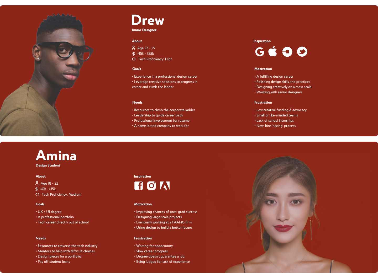
Personas
Who are our users?
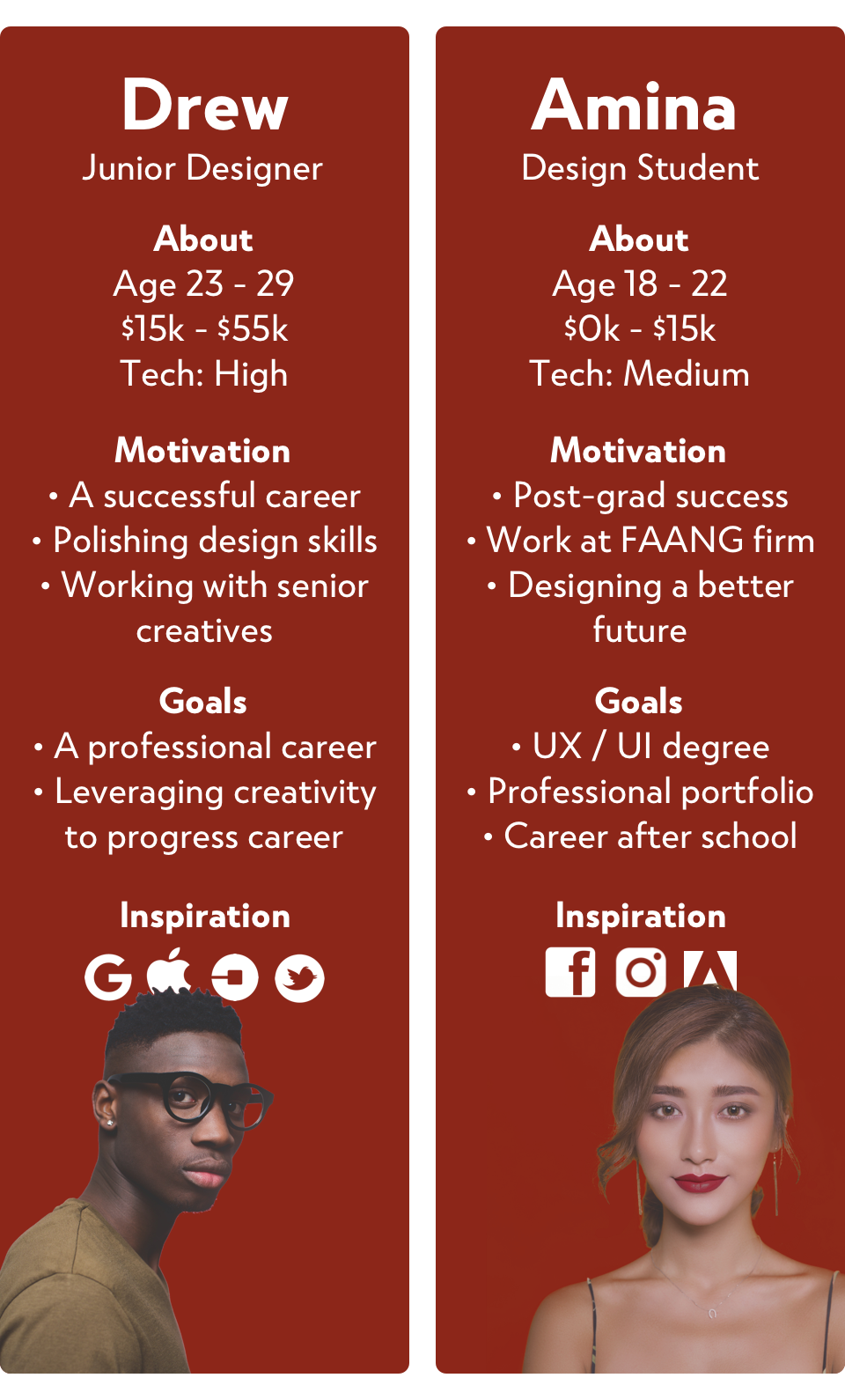
Before the interview process, we averaged our users into two categories - two personas. Our goal was to cater every design decision in this project towards them.

UX Challenges
Challenge #1
How do we populate content? To empathize with our defined personas, we conducted interviews with students who fit them, gathered feedback, and inquired about ideas they may have. Here's a noteworthy example:

We considered combing through the internet weekly and curating events ourselves. This process would be simple, but time consuming and may lead to bias. Based on the quote above, we decided on a solution.
Solution #1
The ‘Submit Event’ button allows users to contribute event ideas directly to the site. Paired with our teams curated content, site upkeep is reduced. (CTA strategically located below the last displayed event.)

Challenge #2
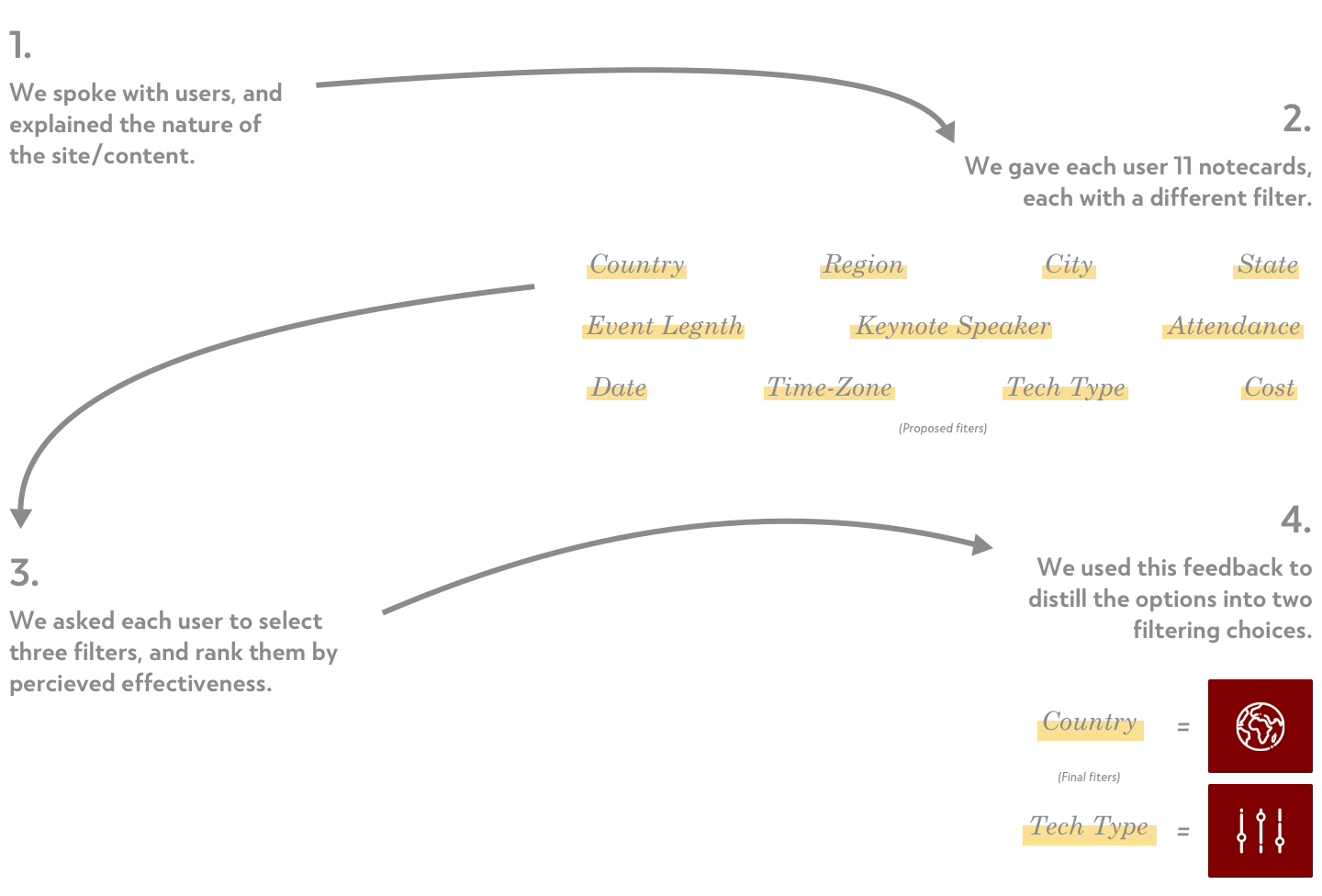
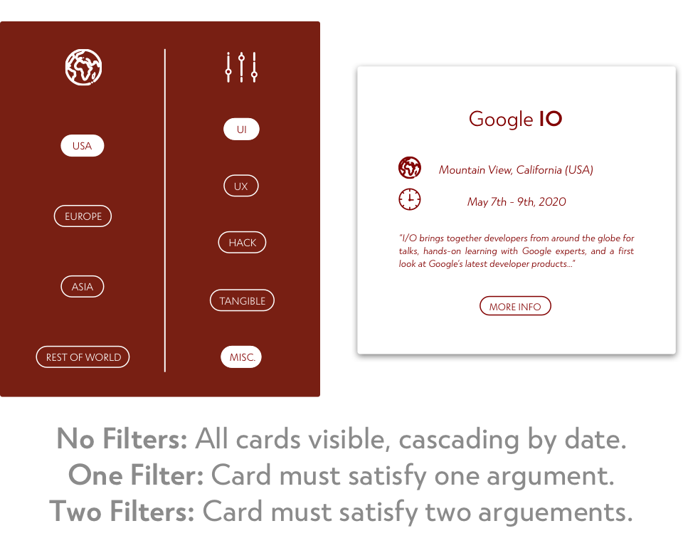
How do we filter content? To answer this question, we turned to our users. We brainstormed a list of all the possibilities, and served these up to our users to get a better insight into the product they wanted to see, and how it might work.

Solution #2
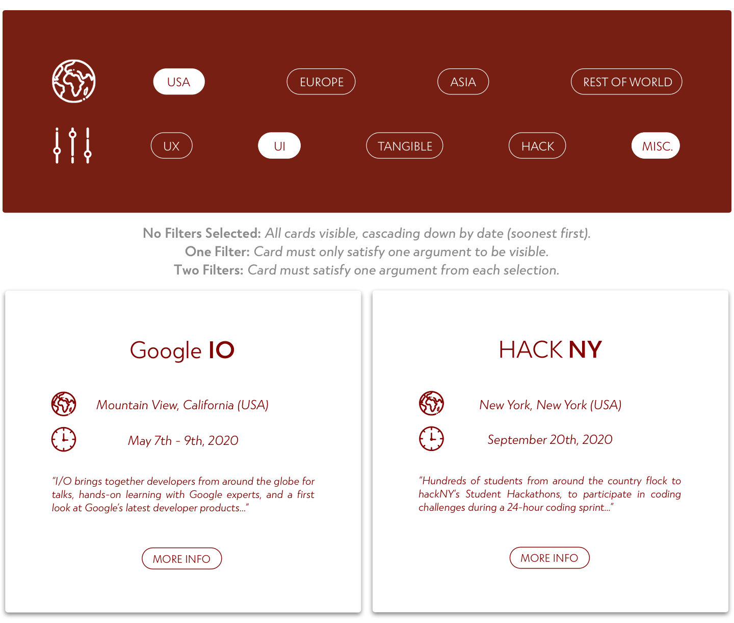
From this, we were able to take the filter one step further and determine which subsets of each choice would provide the most flexibility, without becoming hyper-specified.

Animation
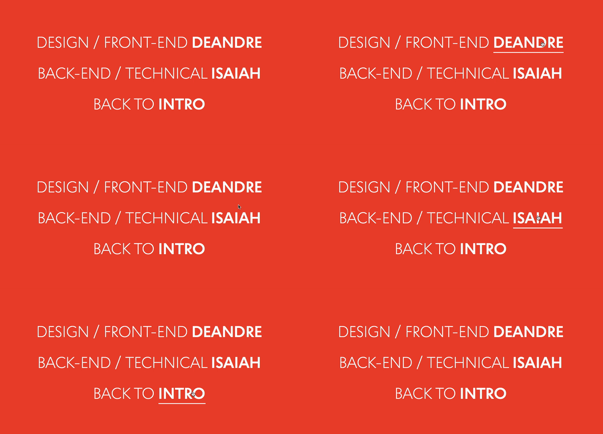
Consistent with the soft curves and smooth fades of the site, we designed buttons and hover-states to feel bouncy as well. These small interactions add uniformity and predictability to the interface.
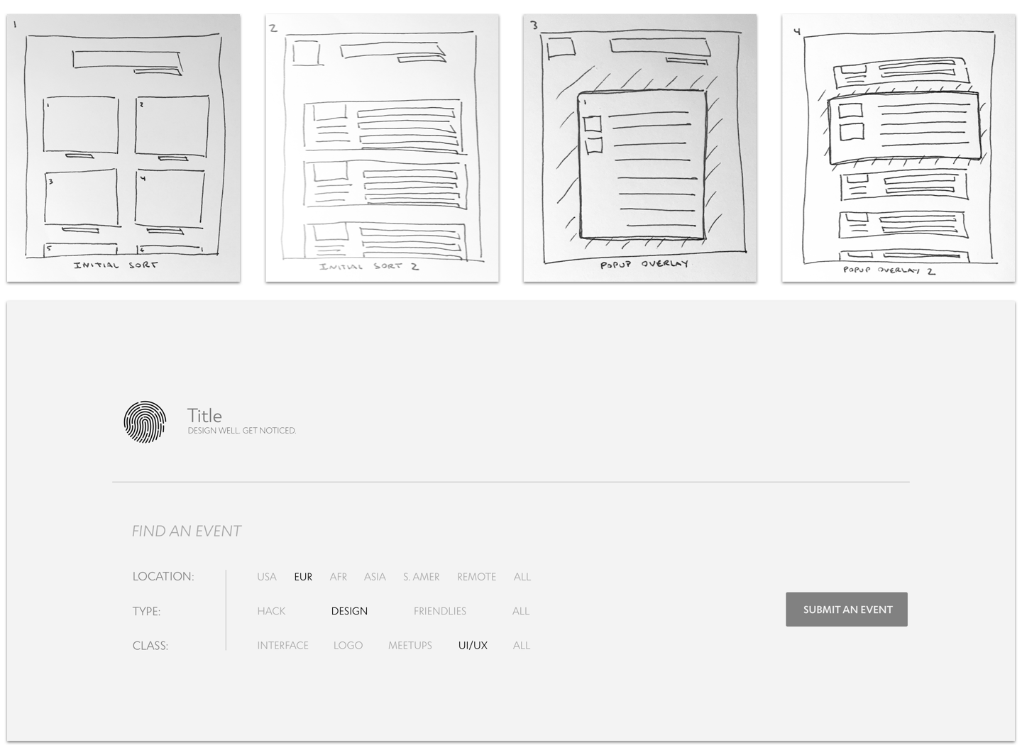
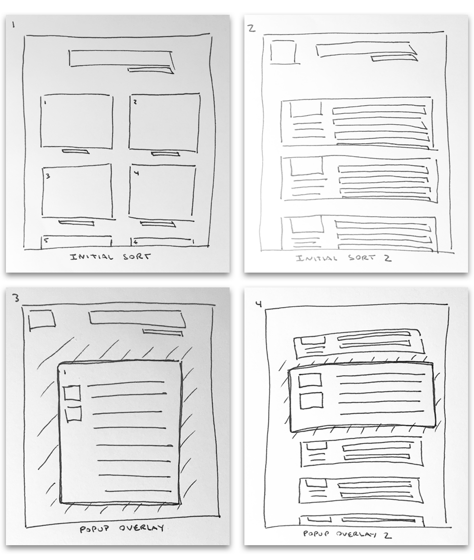
Sketches

Designs
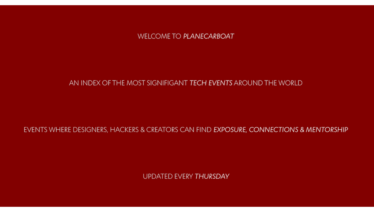
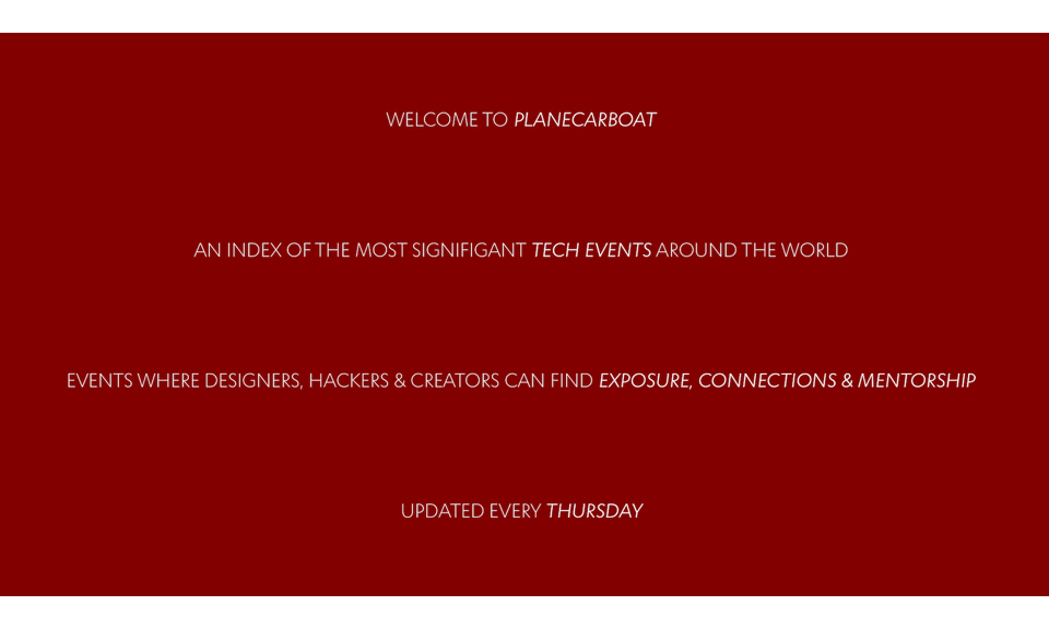
We felt a brief introductory page would be the most efficient way to explain the site. If designed correctly, this shouldn't increase page bounce.
The verbiage went through a series of iterations in an effort to stay meaningful, without being long-winded.
Ill be scrutinizing the analytics in the months following initial launch to see if this intro page should be kept, changed, or trashed.

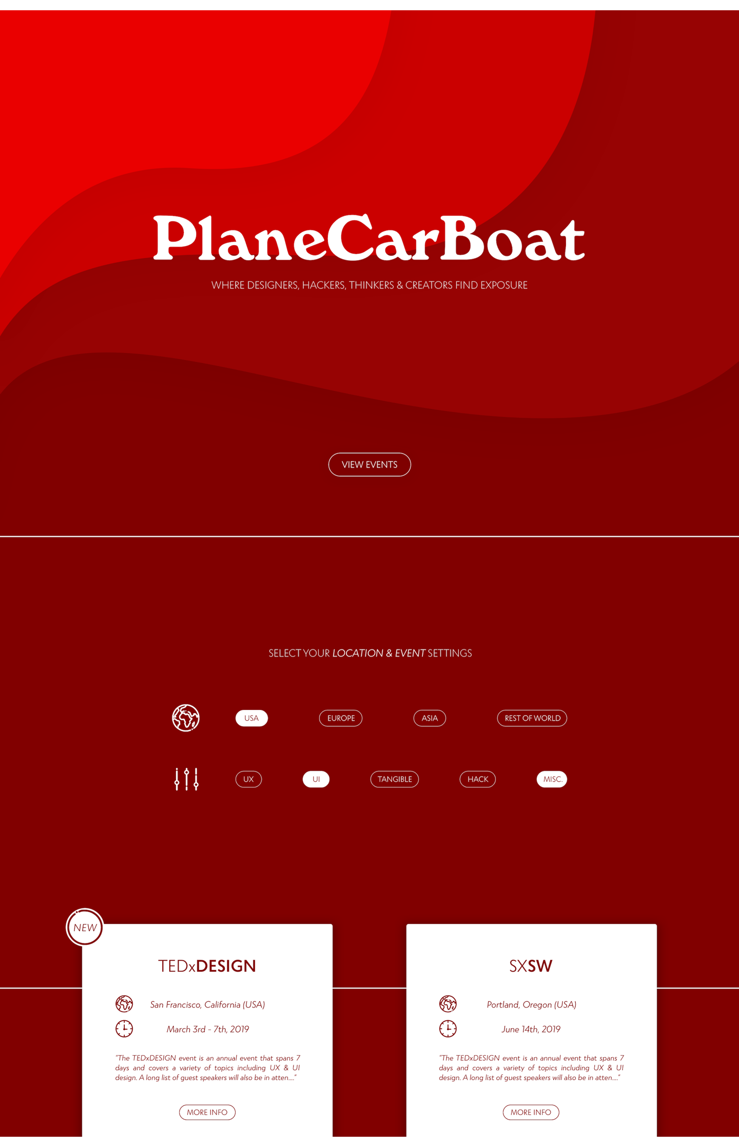
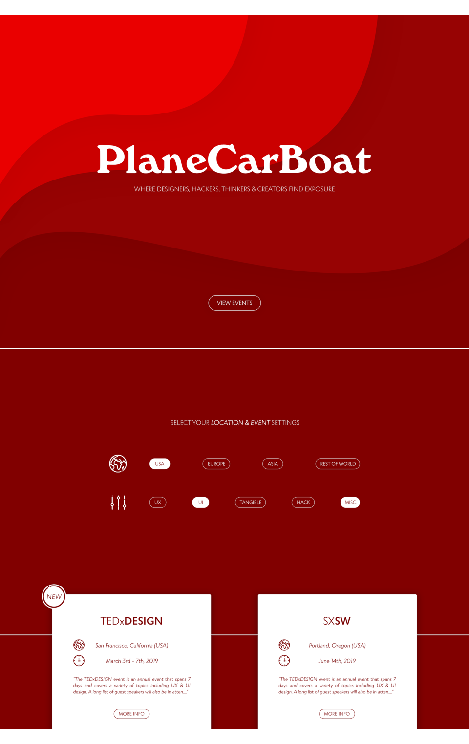
On the landing page we added 'breadcrumbs' at the folds to simplify site navigation. We designed content so that clicking the 'View Events' button auto-scrolls the page.
Auto-scrolling reveals the filtering UI, and more importantly the top of the first two cards, encouraging users to continue.
(Pictured below, white lines illustrate where auto-scroll stops, and how the content would be visible, peeking from the bottom of the viewport.)

Results
My favorite part of this project was simply talking with students and friends, better empathizing with the situations and plights we all go through during the strange transition from student to professional. I can only hope that our site helps people through these curious moments.
This project is on hold, but if you'd like to see the progress, here's a link.

Plane
Car
Boat
Abstract
Problem: College graduates struggle to stand out.
Solution: PlaneCarBoat! A site designed to help creators find opportunities to network.
Meetups are the best place to connect and grow!
(Events like these are exactly how I landed two internships!)
Background
Role: UX / UI, Front-End
Medium: Website
Tools: Sketch, Interviews, Usability Testing
Deliverables: Sketches, Designs, Front-End Code
Personas
Who are our users?
Before the interview process we created two personas, these guided our design decisions.

UX Challenges
Challenge #1
How do we populate content? To answer this we interviewed students, gathered feedback, and inquired about ideas they may have. Here's an example:

We first considered curating all events ourselves, but this would be time consuming and biased. Based on the quote above, we decided on a solution.
Solution #1
The ‘Submit Event’ button allows users to contribute event ideas. Combined with our curated content, site upkeep is reduced. (Located below the last displayed event.)

Challenge #2
How do we filter content? To answer this, we turned to our users. We brainstormed a list of filtering options, gave it to our users, and asked for insight.

Solution #2
From here, we determined which subsets of each choice would provide the most flexibility, without becoming hyper-specified.

Animation
Consistent with the soft curves of the site, we designed interactions to feel bouncy, adding life to the interface.


Sketches

Designs
We felt a brief introductory page would be an efficient way to explain the site, hopefully without increase page bounce.
Ill be scrutinizing the analytics after initial launch to decide whether the intro page should be kept, changed, or trashed.

On the landing page we added 'breadcrumbs' at the folds to simplify site navigation. We designed content so that clicking the 'View Events' button auto-scrolls the page.
Auto-scrolling reveals the filtering UI, and more importantly the top of the first two cards, encouraging users to continue.
Pictured below, white lines illustrate where auto-scroll stops, and how content would be visible, peeking from the bottom of the viewport.

Results
My favorite part of this project was talking to people, empathizing with the situations and plights we all go through during the strange transition from student to professional.
This project is paused, but if you'd like to see it, here's a link.
Special thanks to Isaiah.

